CSS样式: 进行美化页面即html标签中的style
大纲:
1.CSS样式应用方式
2.CSS样式的选择器
3.CSS样式的大致内容
CSS样式应用方式:即CSS样式写在哪
1.应用在html标签上
<img src="..." style="color:red" />
<div style="color:red">你好</div>
2应用.在head里面
<head><meta charset="UTF-8"><title>大米</title><style>body{margin:0;}.header{background: #333;}.container{width: 1226px;margin: auto;}.menu{float: left;}.account{float: right;}.header a{font-size: 12px;color: #b0b0b0;margin-left: 10px;height: 40px;line-height: 40px;}</style>
</head>
3.应用在文件里: 使用情况:布局多个页面时避免重复写style
在head里面导入文件
<link rel="stylesheet" href="放css样式的文件.css(基于falsk框架写的网站css文件写在static目录下)">
CSS样式选择器: 即如何去调用写好的CSS样式
1.类选择器 :
<!DOCTYPE html>
<html lang="en">
<head><meta charset="UTF-8"><title>111</title><style>.c1{color: red;}</style>
</head>
<body><div class="c1">你好</div>
</body>
</html>
2.后代选择 :
<!DOCTYPE html>
<html lang="en">
<head><meta charset="UTF-8"><title>111</title><style>.c1>li{color: pink !important; /* 把 !important 放在属性值和分号之间 */}.c1 li{color: red;}</style>
</head>
<body><div class="c1"><li>你好</li><div><li>你好</li></div></div></body>
</html>
3.标签选择器:
<!DOCTYPE html>
<html lang="en">
<head><meta charset="UTF-8"><title>111</title><style>div{color: red;}</style>
</head>
<body><div>你好</div><h1>你好</h1></body>
</html>
4.id选择器:
<!DOCTYPE html>
<html lang="en">
<head><meta charset="UTF-8"><title>111</title><style>#c1{color: red;}</style>
</head>
<body><div id="c1">你好</div></body>
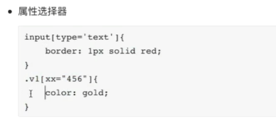
</html>5.属性选择器:
6.补充:多个选择器和覆盖
<!DOCTYPE html>
<html lang="en">
<head><meta charset="UTF-8"><title>111</title><style>.c1{color: red !important;}.c2{color: pink;}</style>
</head>
<body><div class="c1 c2">你好</div>
</body>
</html>
CSS样式大致内容
1.高度和宽度设置
.c1{color: red;height: 40px;width: 50%;
}注意事项:1.宽度支持百分比 2.行内标签设置高度和宽度支撑不起来,得用display:block改变 3.虽然块级标签使用宽度限制其在此行所占位置,但此行剩余部分依然不可以被使用,得用display: inline-block改变
2.块级,行内标签转换设置: 用display进行改变: 块级->行内 和 行内->块级 或 既具有行内又有块级的特性
#块级变行内 display:inline
.c1{color: red;height: 40px;width: 50%;display: inline;
}
<div class="c1">你好</div> #此时块级标签变成行内标签所以c1里面的宽度对其无效 
#行内变块级
.c1{color: red;height: 40px;width: 50%;display: block;
}
<span class="c1">你好</span>     #变成块级标签后可以进行设置宽度   此行后面剩余部分则不可被其他标签占用
#即具有块级和行内的特性
.c1{color: red;height: 40px;width: 50%;display: inline-block;
}
<div class="c1">你好</div>        或        <span class="c1">你好</span>
你好
3.字体设置: 颜色 大小 加粗 字体格式
.c1{color: red;                #字体颜色font-size: 20px;           #字体大小font-weight: 600;          #字体粗细font-family: Arial;        #字体格式
}
<span class="c1">你好</span>
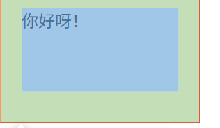
4.文字对齐方式: 水平居中(text-align : center) 垂直居中(line-height : 设置的(height))
.c1{color: red;height: 80px;width: 150px;text-align: center;             #水平对齐line-height: 80px;              #垂直对齐border: 1px solid red;          #加边框(可视化)display: inline-block;
}
<span class="c1">你好</span>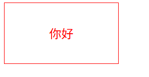
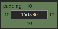
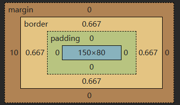
5.内边距: padding 为自己原有位置扩展领域(在块级区域中保持自己高宽(150,80)不变,向外扩张padding的值,则扩张后的区域也是属于这个块级区域的)
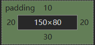
.c1{height: 80px;width: 150px;border: 1px solid red;padding-top: 10px;padding-left: 10px;padding-right: 10px;padding-bottom: 10px;                    #简写:padding:10px 20px 30px 20px 上 右 下 左  图3
}
<div class="c1">你好呀!</div>
你好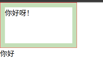
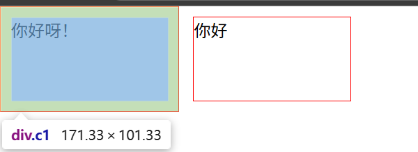
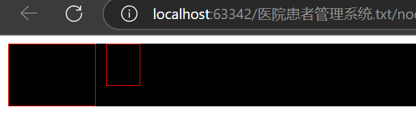
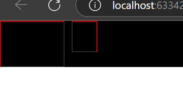
6.外边距: margin
.c1{height: 80px;width: 150px;border: 1px solid red;display: inline-block;
}
.c2{height: 80px;width: 150px;border: 1px solid red;margin-left: 10px;display: inline-block;
}
<div class="c1">你好呀!</div>
<div class="c2">你好</div>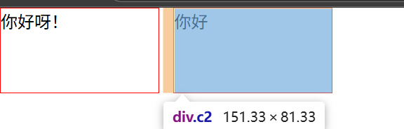
遇到的问题:第一个div中CSS样式有添加内边距时 第二个div标签不在顶端,如图: 解决办法:浮动并排
7.浮动并排 float
困惑点:既然可以把块级标签通过display:inline-block使其不在霸道,让此行剩余部分让别人进行占用 ,为什么要有浮动并排
困惑点可视化:6中遇见的问题
原因
简单说:两个元素并排时,默认是按“文字基线”对齐的(就像写字母时,字母底部对齐那条线)。第一个元素加了内边距(padding),把自己撑高了,它的“基线”位置也跟着变低了。
第二个元素没加内边距,就跟着这个变低的基线对齐,所以看起来它的顶部没对齐,好像往下挪了一点。
解决办法:
1.给第二个元素加一句 `vertical-align: top;`,强制让它们顶部对齐,就顶格了。
2.把两个元素都改成块级元素,再用浮动并排先去掉 display: inline-block,然后给两个元素都加 float: left。
6中问题解决
body{margin: 0;
}.c1{height: 80px;width: 150px;border: 1px solid red;padding: 10px;float: left;
}
.c2{height: 80px;width: 150px;border: 1px solid red;margin-left: 10px;float: left;
}<div class="c1">你好呀!</div>
<div class="c2">你好</div>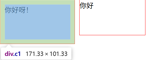
浮动并排:
查看代码
<!DOCTYPE html>
<html lang="en">
<head><meta charset="UTF-8"><title>111</title><style>body{margin: 0;}.a1{background-color: black;}.a1 .c1{height: 40px;border: 1px solid red;padding: 10px;float: left;}.a1 .c2{height: 40px;border: 1px solid red;margin-left: 10px;float: left;}</style>
</head>
<body><div class="a1">                              #父级<div class="c1">你好呀!</div><div class="c2">你好</div><div style="clear:both"></div>            #给父元素加 “清除浮动”,避免父元素高度坍塌(避免父级元素被覆盖)</div>
</body>
</html>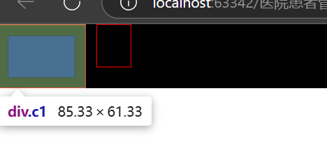
注意点:父级如果没有高度或者宽度,孩子若有高度或者宽度则会把父级支撑起来
如果父级中存在孩子浮动则要加避免坍塌的语句
8.body:body标签默认有边距造成页面四周有间隙
解决办法:
body{margin: 0;
}
9.内容居中: 文本居中 区域居中
1.文本居中: text-align:center line-height:height
body{margin: 0;
}.a1{background-color: black;
}
.a1 .c1{color: white;height: 60px;border: 1px solid red;text-align: center;line-height: 60px;float: left;
}
.a1 .c2{height: 40px;border: 1px solid red;margin-left: 10px;float: left;
}<div class="a1"><div class="c1">你好呀!</div><div class="c2">你好</div><div style="clear:both"></div>
</div>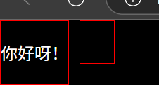
2.区域居中: 自己得有宽度+margin-left:auto margin-right:auto
.a1{height: 100000px;width: 100px;background-color: pink;margin: 0 auto;    #上0 右平均 下0 左平均}
<div class="a1"></div>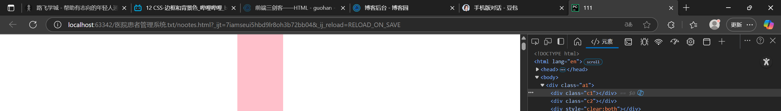
10.背景色和边框:
背景色:background-color: pink;
边框:border: 1px solid red;     transparent透明色
11. hover伪装: 不仅可以改变自己还可以改变自己内部的标签的元素
改变自己:
.a1 .c1 a{height: 60px;text-align: center;line-height: 60px;float: left;text-decoration:none;
}
.a1 .c1 a:hover{color: red;
}<div class="a1"><div class="c1"><a href="https://www.luffycity.com/study/vip-card/5AG2JbrKlMwQ578EHw" target="_blank">点击跳转</a></div>
</div>
鼠标放上前: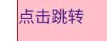 鼠标放上后:
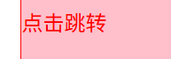
改变自己内部标签的元素
.a1{height: 100000px;width: 65%;margin: 0 auto;border: 1px solid red;
}
.a1 .c2{width: 100px;height: 60px;text-align: center;line-height: 60px;margin-left: 10px;float: left;color: -webkit-link;
}.a1 .c2 .b1{display:none;
}.a1 .c2:hover .b1{display:block;
}<div class="a1"><div class="c2"><div>作者微信</div><div class="b1"><img src="./images/微信图片_20251024215623_91_2.jpg" alt="作者微信"></div></div>
</div>CSS 中鼠标悬停的伪类是 :hover(冒号开头),必须紧跟在要触发 hover 的元素选择器后面(比如 .c2:hover),表示 “当鼠标悬停在 .c2 上时”,再去控制它内部的 .b1 元素。
修改后,当鼠标放到 “作者微信” 所在的 .c2 区域时,图片就会显示出来了。
鼠标放上前 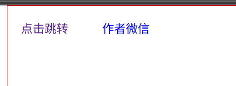 鼠标放上后
鼠标放上后 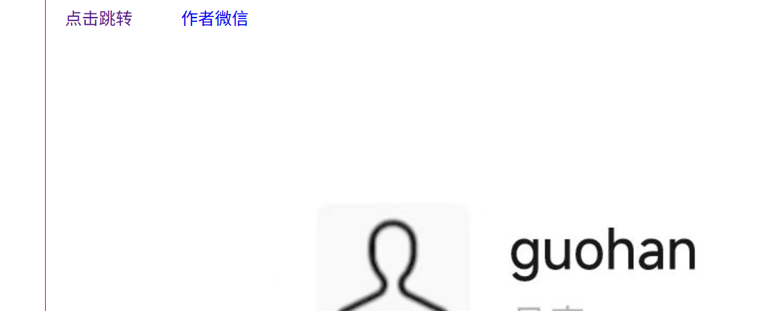
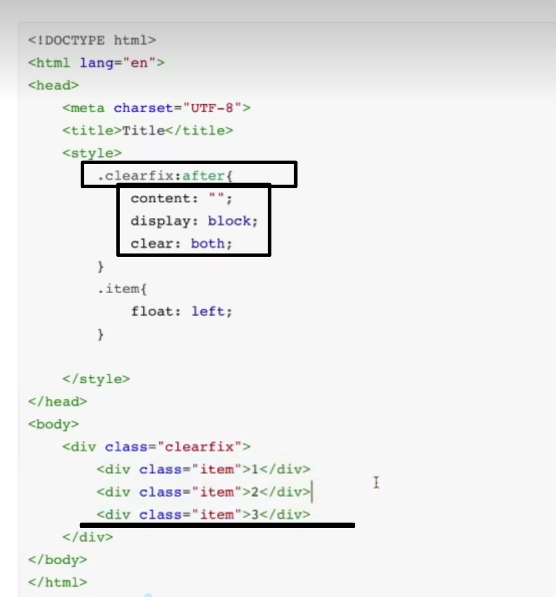
12.after伪装: .clearfix:after
.clearfix:after{content: "";display: block;clear: both;
}
13.opacity: 透明度(0-1)
.fix{position:fixed;top:0;left:0;width:100%;height:100%;background-color:black;opacity:0.5;
}
<div class="fix"></div>position: fixed 定位的元素无法通过 margin 来调整基于浏览器视口的位置,原因和它的定位机制有关:
当元素设置 position: fixed 时,它的定位参考是浏览器的视口(整个窗口),并且会完全脱离正常文档流。此时 margin 的作用逻辑发生了变化:
正常文档流中,margin 是用来控制元素与其他元素的间距;
但 fixed 定位的元素已经 “悬浮” 在视口上,margin 无法让它相对于视口产生偏移,只能影响它内部内容的排版(比如如果它里面有子元素,margin 可以控制子元素和它的间距)。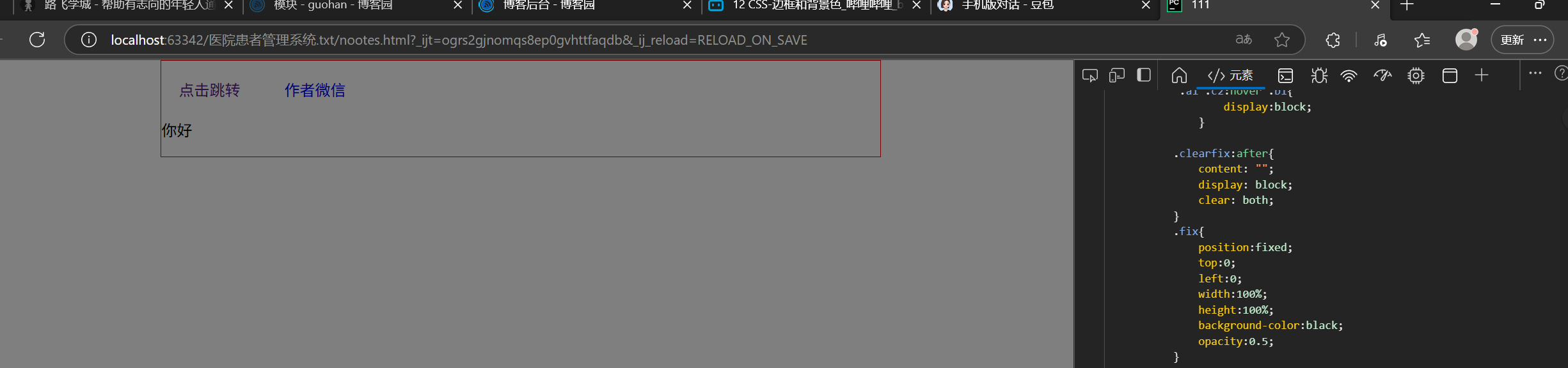
14.position : fixed relative absolute 后两者进行搭配使用
1.position:fixed:固定方式 相对于浏览器
脱离文档流,不影响去他元素布局 定位参考:浏览器视口 用于悬浮固定的场景
.fix{position:fixed;bottom:10px;right:10px;height:40px;width:40px;border:1px solid red;
}
<div class="fix"></div>
.bb{position:fixed;width:400px;height:400px;left:0;right:0;margin:0 auto;background-color:black;
}
<div class="bb"></div>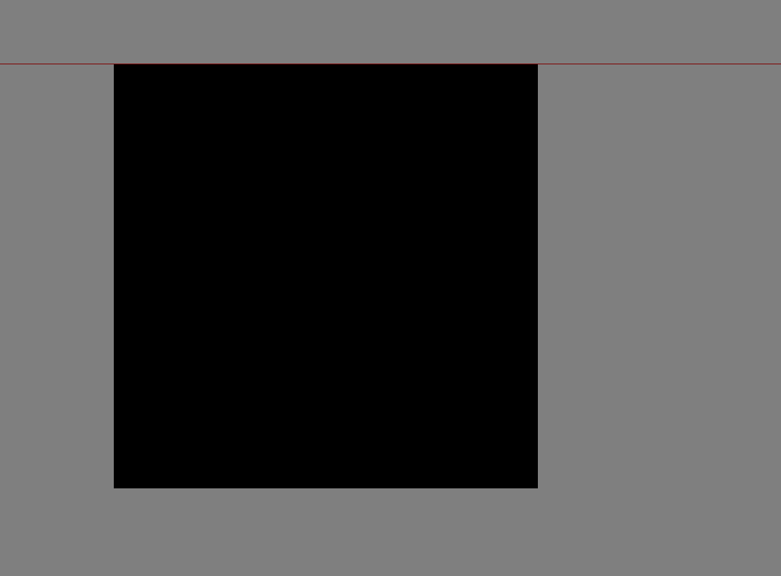
2.relative absolute
.aa{position: relative;height: 500px;width: 500px;margin: 0 auto;border: 1px solid red;
}
.aa .bb{position: absolute;height: 50px;width: 50px;background-color: red;
}
<div class="aa"><div class="bb"></div>
</div>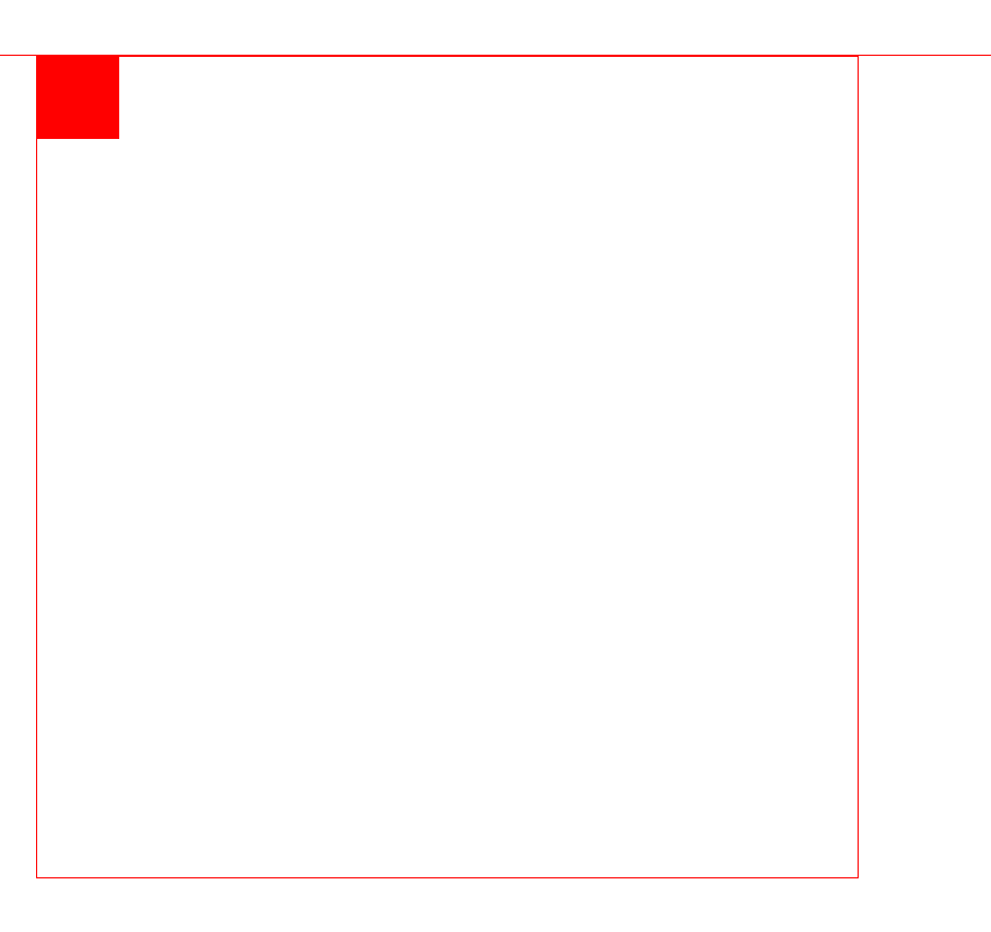
)

![Luogu P3862 数圈 题解 [ 蓝 ] [ 递推 ] [ 打表 ]](http://pic.xiahunao.cn/Luogu P3862 数圈 题解 [ 蓝 ] [ 递推 ] [ 打表 ])


 - Higurashi)


)
)