文章目录 一、对话框 二、无限符号 三、放大镜 四、月牙 五、加号 六、叉号 七、标签 八、圆角三角形 九、普通三角形 十、五角星🇨🇳 十一、平行四边形 十二、六边形 十三、钻石 十四、长方形折角效果
< divclass = " talk-bubble" > </ div> < style> .talk-bubble { position : relative; width : 120px; height : 80px; background : #409EFF; border-radius : 8px; } .talk-bubble::before { content : "" ; position : absolute; right : 100%; top : 50%; width : 0; height : 0; border-top : 12px solid transparent; border-right : 22px solid #409EFF; border-bottom : 12px solid transparent; transform : translate ( 0, -50%) ; }
</ style>
< divclass = " infinity" > </ div> < style> .infinity { position : relative; width : 140px; height : 70px; } .infinity::after,.infinity::before { content : "" ; position : absolute; top : 0; left : 0; width : 50%; height : 100%; border : 20px solid #409EFF; border-radius : 50% 50% 0 50%; transform : rotate ( -45deg) ; } .infinity::after { left : auto; right : -100px; border-radius : 50% 50% 50% 0; transform : rotate ( 45deg) ; }
</ style>
< divclass = " magnifying-glass" > </ div> < style> .magnifying-glass { position : relative; width : 100px; height : 100px; border : 15px solid #409EFF; border-radius : 50%; } .magnifying-glass::before { content : "" ; position : absolute; right : -80%; bottom : -40%; width : 100%; height : 25%; border-width : 0; background : #409EFF; transform : rotate ( 45deg) ; }
</ style>
< divclass = " crescent" > </ div> < style> .crescent { width : 80px; height : 80px; border-radius : 50%; box-shadow : 15px 15px 0 0 #409EFF; }
</ style>
< divclass = " plus" > </ div> < style> .plus { position : relative; width : 20px; height : 100px; background : #409EFF; } .plus::after { content : "" ; position : absolute; top : 50%; left : 50%; width : 100px; height : 20px; transform : translate ( -50%, -50%) ; background : #409EFF; }
</ style>
< divclass = " cross" > </ div> < style> .cross { width : 100px; height : 100px; background-color : #409EFF; clip-path : polygon ( 20% 0%, 0% 20%, 30% 50%, 0% 80%, 20% 100%, 50% 70%, 80% 100%, 100% 80%, 70% 50%, 100% 20%, 80% 0%, 50% 30%) ; }
</ style>
< divclass = " label" > </ div> < style> .label { position : relative; width : 180px; height : 60px; background-color : #409EFF; filter : drop-shadow ( 0px 0px 2px #000) ; } .label::after { content : "" ; position : absolute; left : 100%; top : 0; border : 30px solid transparent; border-left-color : #409EFF; }
</ style>
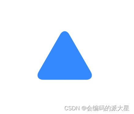
< divclass = " round-triangle" > </ div> < style> .round-triangle { position : relative; background-color : #409EFF; transform : rotate ( -60deg) skewX ( -30deg) scale ( 1, .866) ; } .round-triangle,.round-triangle::after,.round-triangle::before { width : 100px; height : 100px; border-top-right-radius : 30%; } .round-triangle::after,.round-triangle::before { content : '' ; position : absolute; background-color : inherit; } .round-triangle::before { transform : rotate ( -135deg) skewX ( -45deg) scale ( 1.414, .707) translate ( 0, -50%) ; } .round-triangle::after { transform : rotate ( 135deg) skewY ( -45deg) scale ( .707, 1.414) translate ( 50%) ; }
</ style>
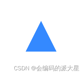
< divclass = " triangle" > </ div> < style> .triangle { width : 0; height : 0; border-left : 50px solid transparent; border-right : 50px solid transparent; border-bottom : 100px solid #409EFF; }
</ style>
< divclass = " star-5" > </ div> < style> .star-5 { position : relative; width : 0px; height : 0px; margin : 50px 0; border-right : 100px solid transparent; border-bottom : 70px solid #FAF408; border-left : 100px solid transparent; transform : rotate ( 35deg) ; } .star-5::after { content : '' ; position : absolute; top : 3px; left : -105px; width : 0px; height : 0px; border-right : 100px solid transparent; border-bottom : 70px solid #FAF408; border-left : 100px solid transparent; transform : rotate ( -70deg) ; } .star-5::before { content : '' ; position : absolute; top : -45px; left : -65px; height : 0; width : 0; border-bottom : 80px solid #FAF408; border-left : 30px solid transparent; border-right : 30px solid transparent; transform : rotate ( -35deg) ; }
</ style>
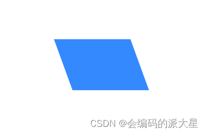
< divclass = " parallelogram" > </ div> < style> .parallelogram { width : 150px; height : 100px; transform : skew ( 20deg) ; background : #409EFF; }
</ style>
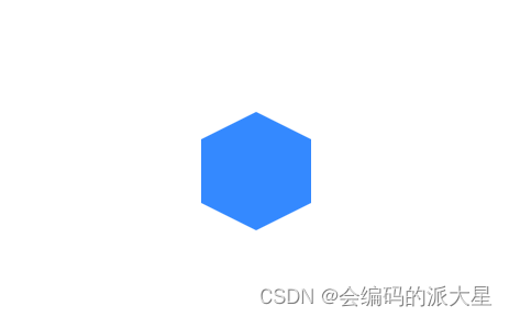
< divclass = " hexagon" > </ div> < style> .hexagon { position : relative; width : 100px; height : 58px; background : #409EFF; } .hexagon::before { content : "" ; position : absolute; top : -25px; left : 0; width : 0; height : 0; border-left : 50px solid transparent; border-right : 50px solid transparent; border-bottom : 25px solid #409EFF; } .hexagon::after { content : "" ; position : absolute; bottom : -25px; left : 0; width : 0; height : 0; border-left : 50px solid transparent; border-right : 50px solid transparent; border-top : 25px solid #409EFF; }
</ style>
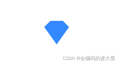
< divclass = " diamond" > </ div> < style> .diamond { position : relative; height : 0; width : 50px; border-style : solid; border-color : transparent transparent #409EFF transparent; border-width : 0 25px 25px 25px; } .diamond::after { content : "" ; position : absolute; top : 25px; left : -25px; width : 0; height : 0; border-style : solid; border-color : #409EFF transparent transparent transparent; border-width : 70px 50px 0 50px; }
</ style>
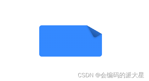
< divclass = " fold-angle" > </ div> < style> .fold-angle { position : relative; width : 200px; height : 100px; background : linear-gradient ( -150deg, transparent 1.5em, #409EFF 0) ; border-radius : .5em; } .fold-angle::before { content : '' ; position : absolute; top : 0; right : 0; background : linear-gradient ( to left bottom, transparent 50%, rgba ( 0, 0, 0, .2) 0, rgba ( 0, 0, 0, .4) ) 100% 0 no-repeat; width : 1.73em; height : 3em; transform : translateY ( -1.3em) rotate ( -30deg) ; transform-origin : bottom right; border-bottom-left-radius : inherit; box-shadow : -.2em .2em .3em -.1em rgba ( 0, 0, 0, .15) ; }
</ style> 


——VIVO介绍网页(1个页面))
![[C][数据结构][时间空间复杂度]详细讲解](http://pic.xiahunao.cn/[C][数据结构][时间空间复杂度]详细讲解)


:VUE3 下的Element-Plus基本使用)

